Visual Design Principles
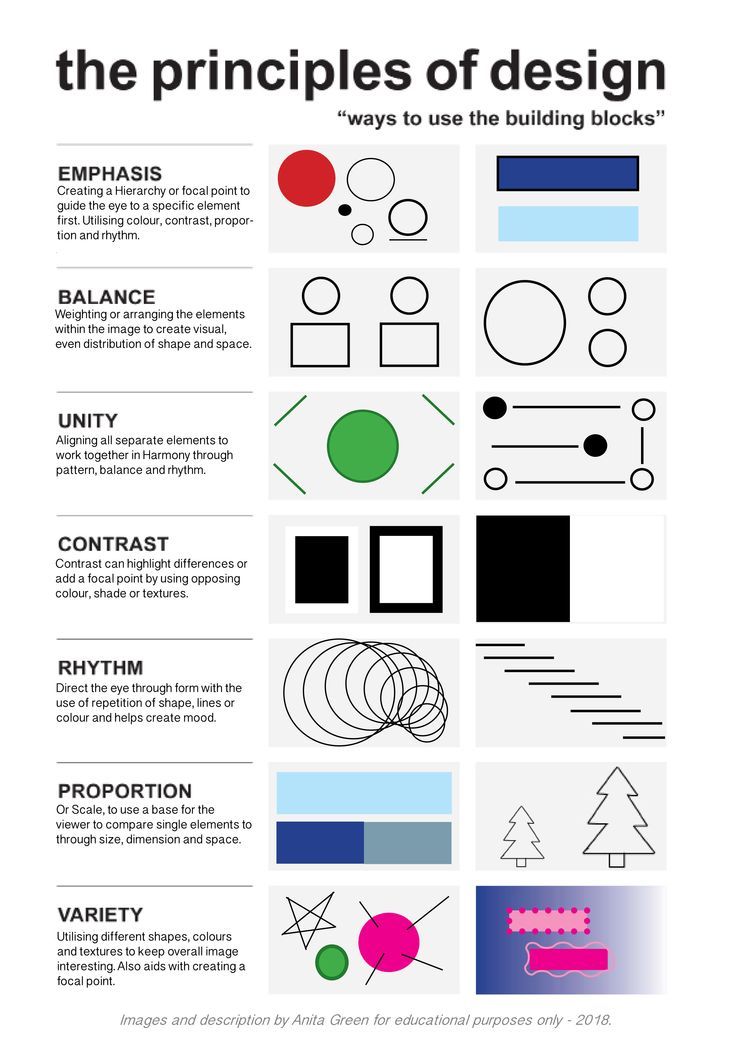
Principles of Design
- Emphasis
- Balance
- Unity
- Contrast
- Rhythm
- Proportion
- Variety
Principles of Design
- Emphasis
- Balance
- Unity
- Contrast
- Rhythm
- Proportion
- Variety
Principles of Design
- Emphasis
- Balance
- Unity
- Contrast
- Rhythm
- Proportion
- Variety
Principles of Design
- Emphasis
- Balance
- Unity
- Contrast
- Rhythm
- Proportion
- Variety
Principles of Design
- Emphasis
- Balance
- Unity
- Contrast
- Rhythm
- Proportion
- Variety
Principles of Design
- Emphasis
- Balance
- Unity
- Contrast
- Rhythm
- Proportion
- Variety
Principles of Design
- Emphasis
- Balance
- Unity
- Contrast
- Rhythm
- Proportion
- Variety
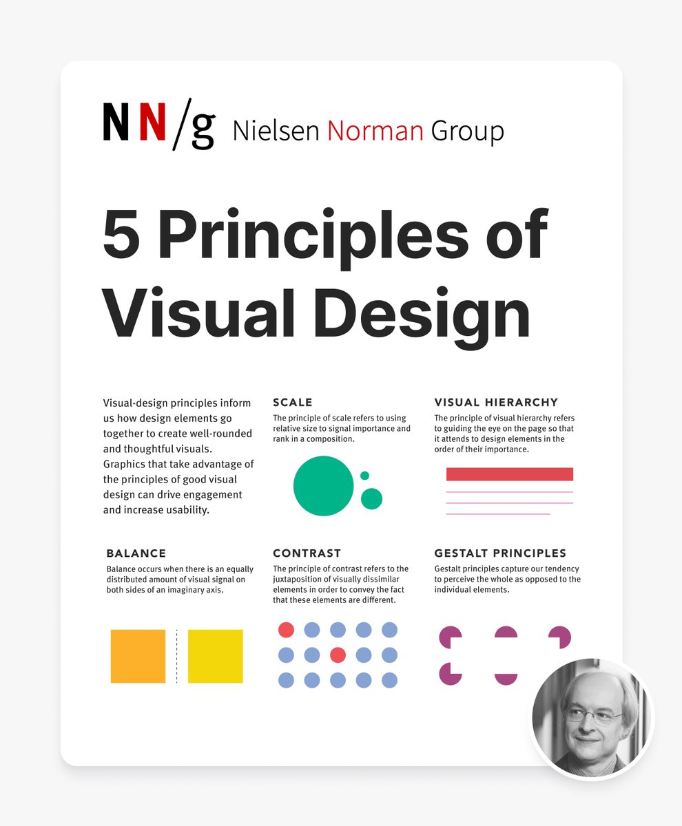
Principles of Visual Design
- Balance
- Scale
- Contrast
- Visual Hierarchy
- Gestalt Principles
Principles of Visual Design
- Balance
- Scale
- Contrast
- Visual Hierarchy
- Gestalt Principles
Principles of Visual Design
- Balance
- Scale
- Contrast
- Visual Hierarchy
- Gestalt Principles
Principles of Visual Design
- Balance
- Scale
- Contrast
- Visual Hierarchy
- Gestalt Principles
Principles of Visual Design
- Balance
- Scale
- Contrast
- Visual Hierarchy
- Gestalt Principles
Typography in UI Design
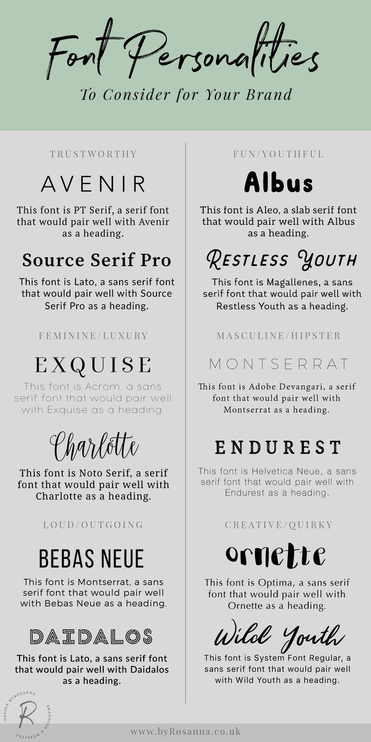
- Font Selection
- Hierarchy
- Line Spacing and Kerning
- Responsive Typography
- Accessibility
Typography in UI Design
- Font Selection
- Hierarchy
- Line Spacing and Kerning
- Responsive Typography
- Accessibility
Typography in UI Design
- Font Selection
- Hierarchy
- Line Spacing and Kerning
- Responsive Typography
- Accessibility
Typography in UI Design
- Font Selection
- Hierarchy
- Line Spacing and Kerning
- Responsive Typography
- Accessibility
Typography in UI Design
- Font Selection
- Hierarchy
- Line Spacing and Kerning
- Responsive Typography
- Accessibility
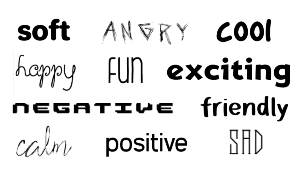
Typography and Emotion
- Font Choice
- Font Weight
- Font Size
- Spacing and Kerning
- Color and Contrast
Typography and Emotion
- Font Choice
- Font Weight
- Font Size
- Spacing and Kerning
- Color and Contrast
Typography and Emotion
- Font Choice
- Font Weight
- Font Size
- Spacing and Kerning
- Color and Contrast
Typography and Emotion
- Font Choice
- Font Weight
- Font Size
- Spacing and Kerning
- Color and Contrast
Typography and Emotion
- Font Choice
- Font Weight
- Font Size
- Spacing and Kerning
- Color and Contrast
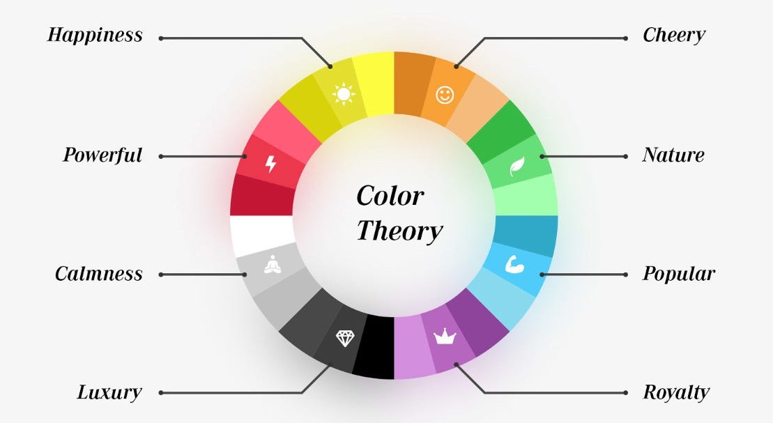
Color Theory and Palettes
- Color Psychology
- Color Harmony
- Contrast and Legibility
- Accessibility Guidelines
- Color Consistency
Color Theory and Palettes
- Color Psychology
- Color Harmony
- Contrast and Legibility
- Accessibility Guidelines
- Color Consistency
Color Theory and Palettes
- Color Psychology
- Color Harmony
- Contrast and Legibility
- Accessibility Guidelines
- Color Consistency
Color Theory and Palettes
- Color Psychology
- Color Harmony
- Contrast and Legibility
- Accessibility Guidelines
- Color Consistency
Color Theory and Palettes
- Color Psychology
- Color Harmony
- Contrast and Legibility
- Accessibility Guidelines
- Color Consistency
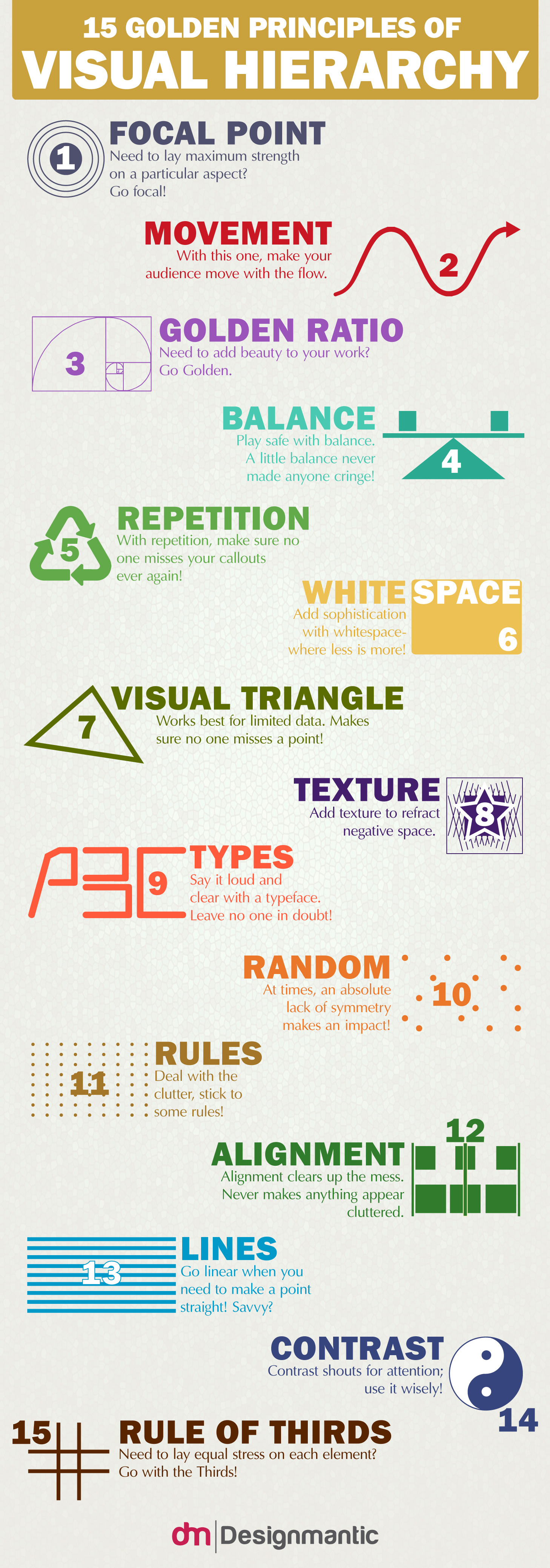
Visual Hierarchy
- Content Prioritization
- Size and Scale
- Color and Contrast
- Typography and Layout
- User Flow
Visual Hierarchy
- Content Prioritization
- Size and Scale
- Color and Contrast
- Typography and Layout
- User Flow
Visual Hierarchy
- Content Prioritization
- Size and Scale
- Color and Contrast
- Typography and Layout
- User Flow
Visual Hierarchy
- Content Prioritization
- Size and Scale
- Color and Contrast
- Typography and Layout
- User Flow
Visual Hierarchy
- Content Prioritization
- Size and Scale
- Color and Contrast
- Typography and Layout
- User Flow
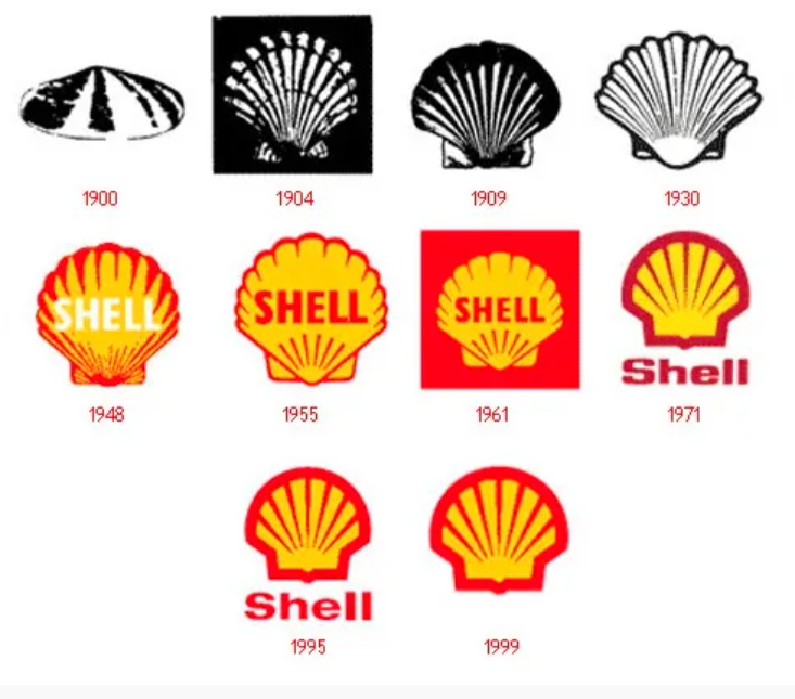
Consistency in Design
- Element Consistency
- Brand Consistency
- Navigation Consistency
- Content Consistency
- Platform Consistency
Consistency in Design
- Element Consistency
- Brand Consistency
- Navigation Consistency
- Content Consistency
- Platform Consistency
Consistency in Design
- Element Consistency
- Brand Consistency
- Navigation Consistency
- Content Consistency
- Platform Consistency
Consistency in Design
- Element Consistency
- Brand Consistency
- Navigation Consistency
- Content Consistency
- Platform Consistency
Consistency in Design
- Element Consistency
- Brand Consistency
- Navigation Consistency
- Content Consistency
- Platform Consistency
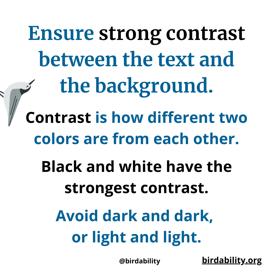
Contrast and Readability
- Text Contrast
- Icon and Button Contrast
- Color Blindness Consideration
- Text Size
- User Testing
Contrast and Readability
- Text Contrast
- Icon and Button Contrast
- Color Blindness Consideration
- Text Size
- User Testing
Contrast and Readability
- Text Contrast
- Icon and Button Contrast
- Color Blindness Consideration
- Text Size
- User Testing
Contrast and Readability
- Text Contrast
- Icon and Button Contrast
- Color Blindness Consideration
- Text Size
- User Testing
Contrast and Readability
- Text Contrast
- Icon and Button Contrast
- Color Blindness Consideration
- Text Size
- User Testing
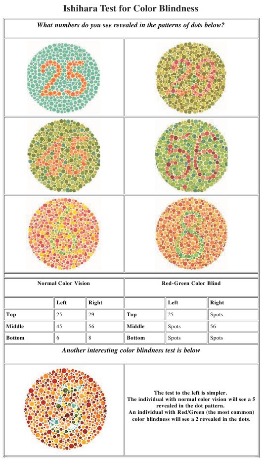
Color Blindness Considerations
- Color Blindness Overview
- Color and Information Conveyance
- Contrast and Readability
- Color Palette Selection
Color Blindness Considerations
- Color Blindness Overview
- Color and Information Conveyance
- Contrast and Readability
- Color Palette Selection
Color Blindness Considerations
- Color Blindness Overview
- Color and Information Conveyance
- Contrast and Readability
- Color Palette Selection
Color Blindness Considerations
- Color Blindness Overview
- Color and Information Conveyance
- Contrast and Readability
- Color Palette Selection