Do’s and Don’ts in UI Elements
In the realm of UI design, understanding the subtleties of various elements is crucial for creating engaging and effective interfaces. This guide delves into the essential do’s and don’ts of UI design, offering insights into best practices and common pitfalls in handling key UI components. By exploring these guidelines, designers can learn how to make informed decisions that enhance usability, aesthetic appeal, and overall user experience. Whether you’re a seasoned professional or a student, this guide serves as a valuable resource for refining your UI design approach, ensuring that every element contributes positively to the user’s journey.
Color
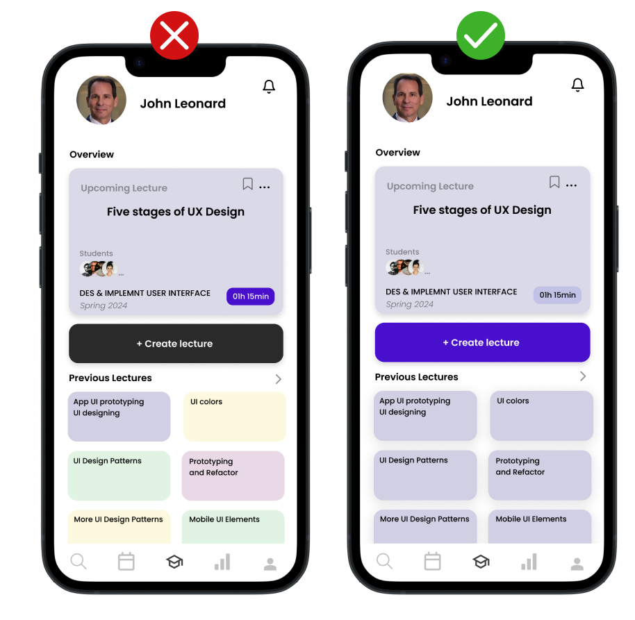
Saturation, a fundamental aspect of color theory, plays a crucial role in UI design, particularly in elements like buttons. Saturation refers to the intensity and purity of a color. High saturation results in vivid, bright colors, whereas low saturation yields more muted, subdued tones. The right level of saturation can significantly affect the visual impact and usability of UI components.
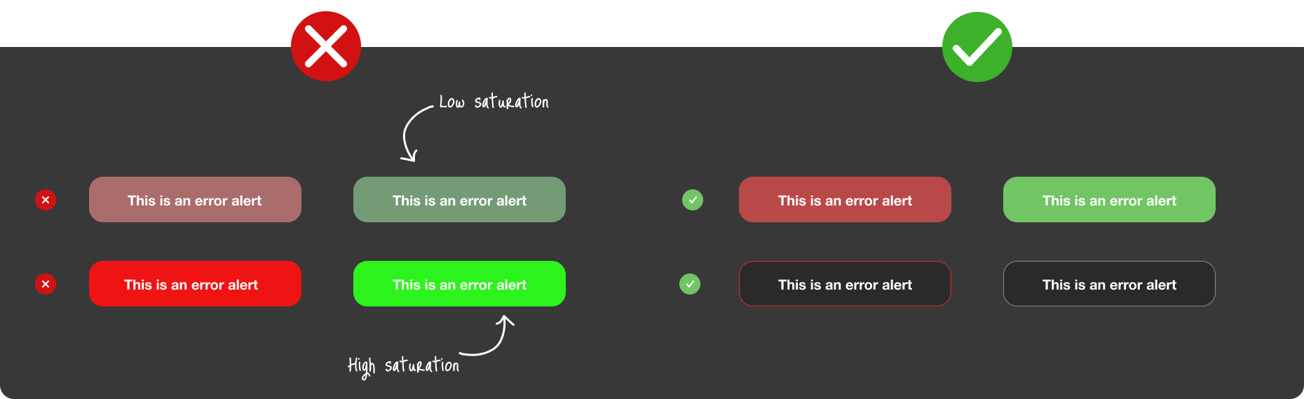
Low saturation can make colors appear washed out or less prominent, which might be suitable for background elements or less important actions. However, using low saturation for primary buttons can diminish their visibility and effectiveness in guiding user actions. On the other hand, high saturation grabs attention due to its vibrancy but can cause eye strain if overused, especially with very bright or neon colors.
Finding the right balance is key. For instance, a button with optimal saturation stands out without being overpowering, effectively drawing user attention to primary actions. Additionally, the use of button strokes or borders with contrasting saturation can enhance visibility and accessibility, making the interface more user-friendly and aesthetically pleasing. Thus, the careful application of saturation in UI design not only impacts the visual appeal but also the overall user experience.
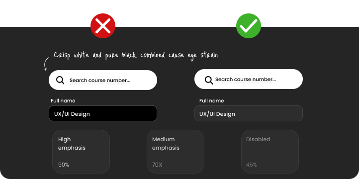
The use of black and its shades in UI design is another crucial aspect that significantly impacts user experience. While pure black (#000000) is a common choice for its boldness and clarity, it can be quite harsh on the eyes, especially when set against high-contrast backgrounds. This starkness can lead to eye strain and a less comfortable viewing experience, particularly in settings with prolonged screen exposure.
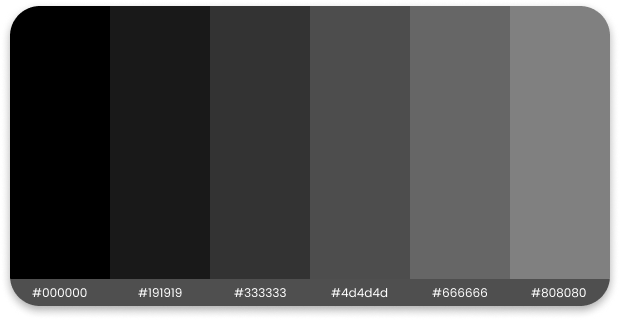
To create a more visually soothing interface, designers often turn to softer shades of black. These shades, like off-black or charcoal, incorporate a hint of gray or another color, helping to reduce the harshness of pure black. The result is a gentler, more nuanced approach that still retains the sophistication and depth associated with black.
When selecting black shades, it’s important to consider how they interact with other elements such as text, background colors, and images. For example, in dark mode designs, a softer black background with well-contrasted text can greatly enhance readability and reduce visual fatigue. Designers may help by paying attention to the shade of black they use.
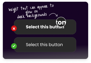
Another important consideration is the use of bright surfaces in dark mode interfaces. When designing for dark mode, it’s crucial to be mindful of not incorporating large, bright surfaces. Users typically opt for dark mode to experience a UI that is easier on the eyes, particularly in low-light environments. In this context, big, bright surfaces can be jarring and counterproductive.
Bright elements in a dark-themed UI can create an uncomfortable glare, disrupting the overall visual harmony of the design. Such surfaces tend to glow excessively compared to the more subdued tones of the rest of the UI, leading to an imbalance that can strain the eyes. This is particularly evident when large areas, like backgrounds or expansive content blocks, are set in bright colors.
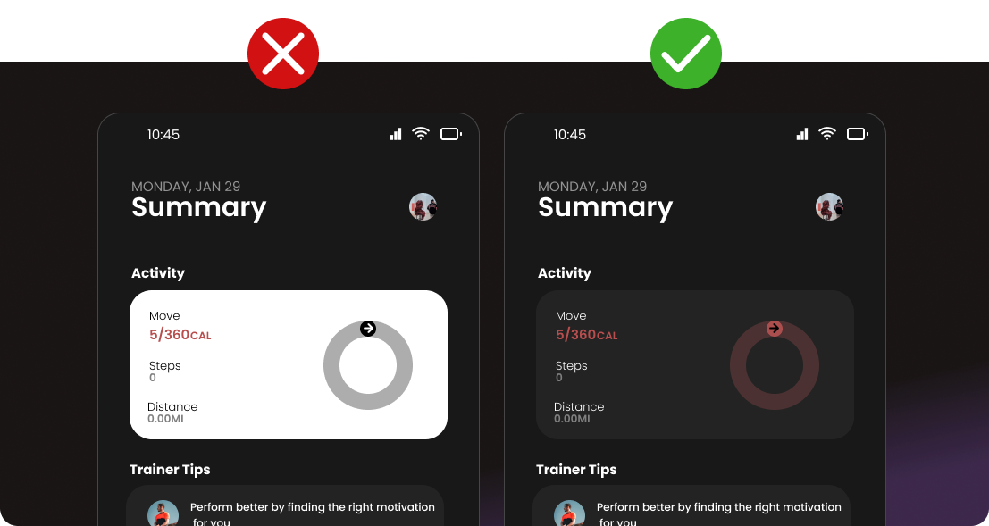
To maintain the user-friendly nature of dark mode, it’s advisable to use bright colors sparingly and strategically. They should be reserved primarily for smaller UI elements that require emphasis, such as buttons, icons, or key text. This approach helps in drawing attention without overwhelming the visual senses. It also preserves the calming and subtle aesthetic that users seek in a dark mode interface.
In UI design, a fundamental practice is to first conceptualize layouts in black and white. This approach ensures the creation of an intentional, well-structured design foundation before introducing color. By focusing initially on grayscale, designers can concentrate on layout, spacing, and the overall user journey without the distraction of color. Once a solid layout is established, color can then be thoughtfully and strategically applied to enhance and highlight key elements. This methodology also encourages designers to be selective with their color choices, avoiding the trap of using colors mindlessly or over-relying on commonly used palettes. Limiting color choices not only streamlines the design process but also leads to a more cohesive and visually effective UI. In essence, starting with black and white paves the way for a purposeful design, where color is used as a powerful tool to guide and engage the user.
Typography
Effective typography extends beyond simply choosing fonts; it’s about harmoniously integrating text into the overall design to ensure a clear and engaging user experience. From font selection and weight to readability and alignment, each typographic detail significantly contributes to the UI’s effectiveness.
When it comes to typography in dark UI design, an essential aspect to consider is the weight of the font. Light-colored text on a dark background naturally appears bolder, which can impact legibility and the overall balance of the interface. By carefully selecting and adjusting font weights, designers can maintain a clean, uncluttered look, crucial for dark mode interfaces. Such consideration in typography not only enhances readability but also contributes to a more comfortable and visually appealing user experience.
Poor typographic hierarchy can significantly hinder the user experience, leading to confusion and reduced usability. When type hierarchy is not well-defined, users oftern struggle to navigate the interface and understand where to focus their attention. The absence of varied font sizes, weights, or styles results in a lack of visual cues that guide the user through the content logically and intuitively.

Simplicity and legibility in typography are essential, particularly for elements like paragraphs, labels, and general text. While complicated and decorative fonts may be visually appealing, they are best reserved for larger headlines where they can make an impactful statement without affecting the overall functionality.
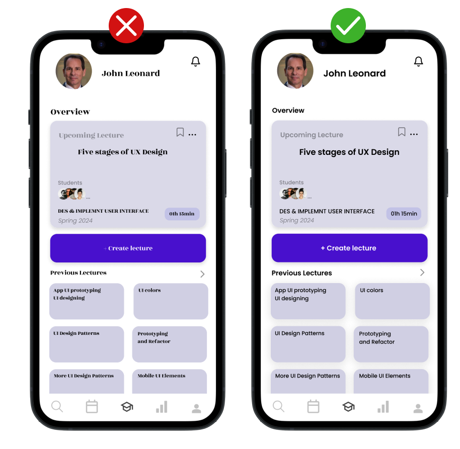
For the bulk of the text, such as body copy and informational labels, it’s important to use simple, clear fonts. These types of fonts ensure that information is easily digestible, allowing users to quickly understand and interact with the content.
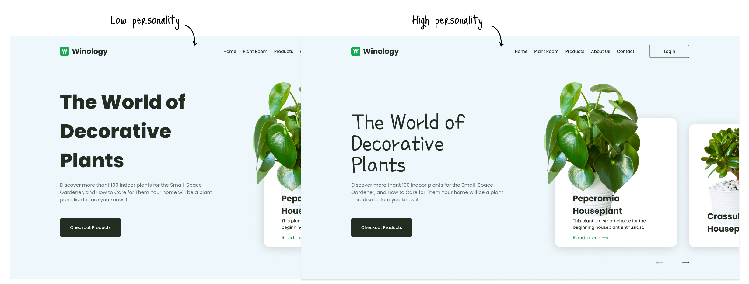
Different typepfaces convey wildly different personalities and fit numberour aesthetics. Play around with them to choose the right font family, weight, style, width, and more.
Don’t forget to utilize emphasis, and embellishments and to stay on brand, if there is any.
Buttons
Buttons are fundamental in guiding user actions, and their design can significantly impact the usability and aesthetic of a product. In this section, we will uncover the do’s and don’ts of button design, highlighting how to effectively use them to enhance user experience. From size and color to positioning and labeling, each aspect plays a crucial role in making buttons both functional and engaging.

When it comes to designing buttons, caution should be exercised with current trends. Trends, while innovative and appealing at first glance, can quickly date a design and often result in a less clean aesthetic. This isn’t to say that designs must lack personality or flair; on the contrary, a touch of creativity is encouraged. However, adopting a principle where “less is more” is frequently the key to crafting more timeless, user-friendly buttons. By focusing on simplicity and functionality, you can ensure that buttons enhance the user interface effectively, without the constraints of passing trends.
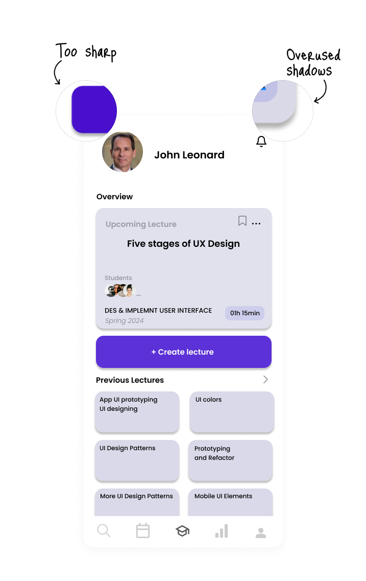
The choice of shadow style can have a significant impact on the overall aesthetic. Instead of relying on default shadow settings, which can often appear harsh or artificial, it’s recommended to use natural, soft shadows. Soft shadows mimic the subtlety of real-world lighting, adding depth and dimension to the design in a more sophisticated manner. They create a gentle contrast that is pleasing to the eye, enhancing the elements without overpowering them. This approach lends a more organic and refined look to the interface, contributing to a cleaner and more cohesive visual experience.
Here is a concise list of different types of shadows and their typical uses in UI design:
Drop Shadow: Used to create a sense of depth, making elements like buttons or cards appear slightly raised above the surface.
Box Shadow: Often applied to containers or panels, providing depth and distinguishing them from the background.
Text Shadow: Adds depth or emphasis to text, enhancing readability against varied backgrounds.
Inner Shadow: Gives an inset effect, commonly used in input fields or to create a sunken look.
Ambient Shadow: Subtle and diffuse, used to provide soft illumination around objects, enhancing realism.
Long Shadow: Extends at a fixed angle, typically used for icons or logos to create a modern, dramatic effect.
Each type of shadow serves a unique purpose, from adding dimensionality to enhancing readability, and can be strategically used to improve the overall aesthetics and functionality of the design.
[not]