Getting around
Overview
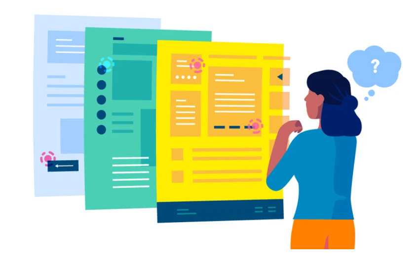
Navigation in user interfaces plays a pivotal role in guiding users through digital experiences, enabling them to seamlessly access content and functionalities within an application or website. Effective navigation design ensures that users can efficiently explore, interact with, and achieve their goals within the interface, ultimately contributing to a positive user experience.
UI signposts, wayfinding, and navigation are fundamental components of user interface (UI) design that collectively ensure users can easily navigate through digital platforms and find their desired content or perform tasks. Signposts, in the form of visual cues like icons, labels, and buttons, guide users by indicating the direction or action to take. Wayfinding involves creating a structured and intuitive path, while navigation elements, such as menus and links, provide the means to move between different sections or pages, resulting in a cohesive and user-friendly UI that enhances the overall user experience.
Our motivation
Guiding User Experience: UI navigation elements serve as signposts and guides, directing users through the interface and helping them find their desired content or complete tasks effectively.
Enhancing Accessibility: Navigation elements play a crucial role in making interfaces accessible to a wider audience, including those with disabilities, by providing clear pathways and keyboard navigation support.
Improving Efficiency: They streamline user interactions, allowing users to move between sections, access features, and retrieve information quickly, leading to a more efficient and productive experience.
Supporting Discoverability: Navigation elements contribute to discoverability by making hidden or less obvious features and content accessible, encouraging users to explore and engage with the interface more comprehensively.
Reducing Cognitive Load: Well-designed navigation elements reduce the cognitive load on users by presenting options and actions in an organized and intuitive manner, making the interface more user-friendly.
UI navigation elements are essential as they guide users, reducing cognitive load, and making interfaces accessible, while also improving efficiency and supporting discoverability, ultimately enhancing the overall user experience. They serve as the backbone of user interaction, enabling users to easily find content, access features, and accomplish tasks within an interface, contributing to its usability and effectiveness.
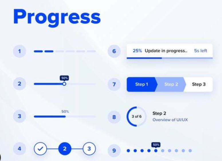
Signposts and Landmarks
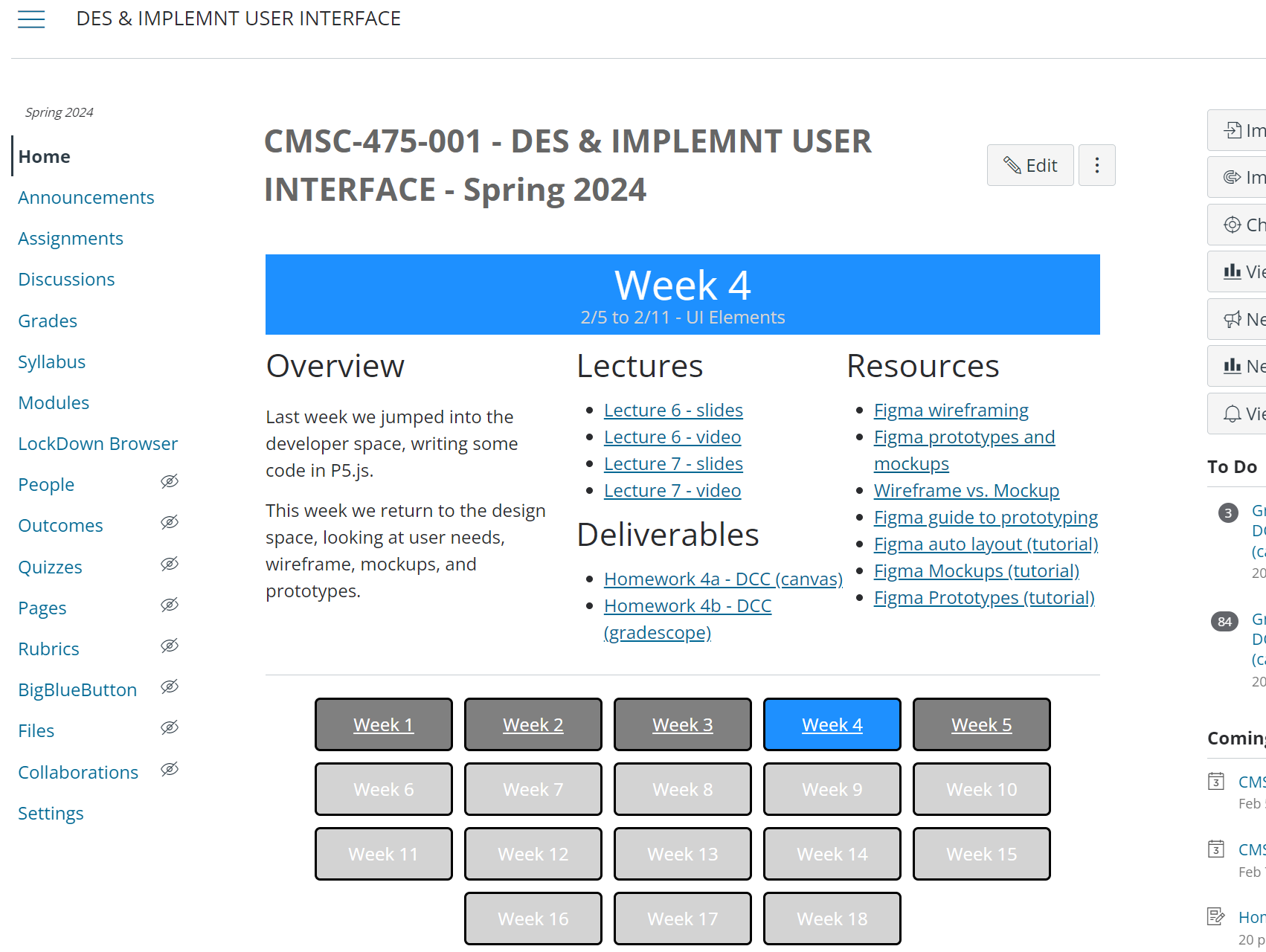
Answering the questions: Where are am I now? What are my immediate surroundings?
Visual Cues: Signposts in navigation serve as visual cues, using icons, labels, buttons, or other graphical elements to guide users and convey information.
Consistency: Maintaining consistent signpost design and placement throughout the interface enhances user familiarity and usability.
Accessibility: Effective signposting is inclusive, considering accessibility standards by providing alternative text for visual cues and ensuring compatibility with assistive technologies.
Examples: Progress indicators, bread crumbs, annotated scroll bars
In UI design, navigation signposts play a crucial role in guiding users and making their journey through the interface intuitive. They enhance the user experience by providing clear directions, highlighting important actions, and ensuring accessibility for all users.
Wayfinding
Answering the questions: Where do I go next? What do I do next? Where will I end up?
Contextual Information: Wayfinding takes into account the context and environment, whether it’s a physical location or a digital interface, and offers relevant information accordingly.
Clear Pathfinding: It involves providing clear directions and visual cues, such as arrows, maps, or landmarks, to guide users toward their destination or goal.
Call-to-Action (CTA) Buttons: Signposts often include CTA buttons that encourage users to take specific actions, such as “Sign Up,” “Learn More,” or “Get Started.”
User-Centered: Effective wayfinding is user-centered, considering the needs, preferences, and familiarity of the users to create a seamless navigation experience.
Reducing Cognitive Load: By simplifying the decision-making process and reducing cognitive load, wayfinding enhances usability and helps users reach their intended destinations efficiently.
In both physical and digital contexts, wayfinding plays a critical role in ensuring that users can navigate their surroundings or interfaces with confidence. It involves providing clear, context-aware guidance to help users find their way and accomplish their goals effectively.
Types of navigation
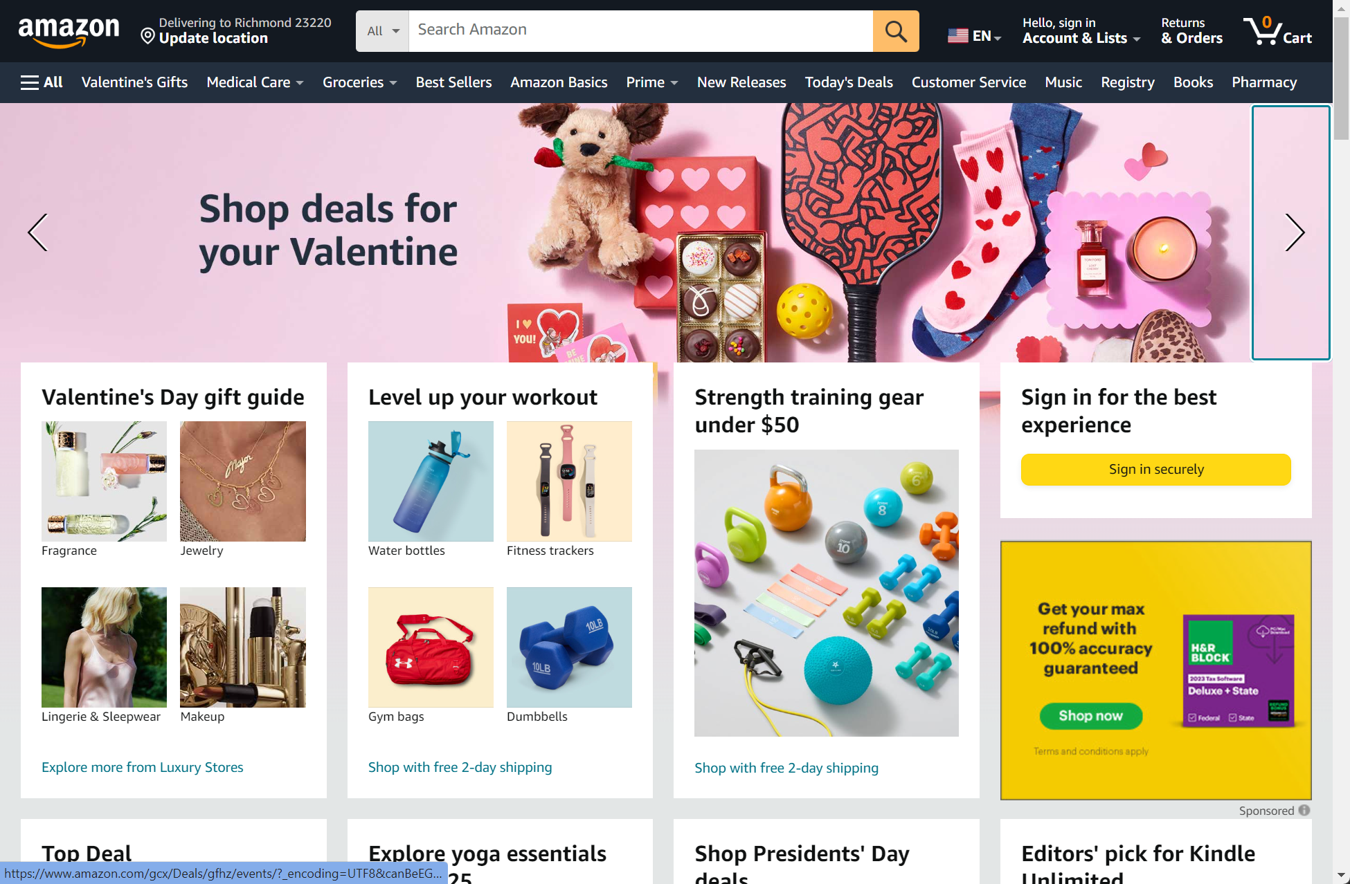
Global Navigation Global navigation typically consists of primary menu items that are visible on every page of a website or application. It offers access to the core sections and main features. Examples include the top navigation bar on a website with links to “Home,” “About Us,” “Products,” “Services,” and “Contact.”
Utility Navigation Utility navigation provides links to secondary or utility functions, such as account settings, user profiles, help, or language preferences. It often complements global navigation. Examples include the top-right corner of a website, icons or links for “Log In,” “Sign Up,” “Settings,” and “Language.”
Associated and Inline Navigation Associated navigation refers to links or navigation elements related to a specific section or topic. It helps users explore related content within the same context. Inline navigation consists of links or navigation elements placed within the content itself, allowing users to access additional information or related topics. Examples: in an article about technology, associated navigation might include links to “Hardware,” “Software,” and “Gadgets.” Inline navigation could feature links to related articles within the text.
Related Content Related content sections display additional articles, products, or information that is relevant to the current page or topic. It encourages users to explore further and discover related content. Example: A blog post may have a “Related Articles” section at the end, suggesting other posts on similar subjects.
Tags Tags are keywords or labels assigned to content items, making it easier for users to find related content. Clicking on a tag typically leads to a list of items with the same tag. Example: A photography website may use tags like “landscape,” “portrait,” or “black and white” to categorize and access photos by style or subject.
Social Navigation Social navigation provides links or sharing options related to social media platforms. It allows users to share, like, or follow content on social networks. Example: social icons at the bottom of an article that allow users to share the content on platforms like Facebook, Twitter, and LinkedIn.
These various navigation and content organization techniques contribute to a comprehensive user experience, helping users explore, discover, and engage with content and features while providing easy access to essential functions and information.
Design Principles

Separate navigation from visual design: a design principle that emphasizes the importance of clearly distinguishing the functional aspects of navigation, such as menus, buttons, and information hierarchy, from the purely visual aspects of design, like colors, fonts, and aesthetics. By keeping these two aspects separate, designers ensure that the usability and effectiveness of navigation elements are not compromised by unnecessary visual embellishments, resulting in a more user-friendly .
Reduce cognitive load: a design principle focused on simplifying user interfaces by minimizing the mental effort required to comprehend, navigate, and interact with them, thereby enhancing user comprehension and efficiency. By streamlining information presentation, simplifying decision-making, and providing clear guidance, designers aim to reduce the cognitive burden on users, resulting in a more intuitive and user-friendly experience.
Keep distances short: a design principle focusing on minimizing the physical or cognitive distance users must traverse within an interface to access information, perform tasks, or navigate, promoting efficiency and ease of use. This principle aims to reduce user effort and frustration by ensuring that elements are logically placed and readily accessible, ultimately enhancing the overall user experience.
Gather frequently accessed items: a design guideline that suggests identifying and prominently placing elements, content, or features within a user interface that users frequently use or access. By doing so, designers can improve user efficiency and satisfaction, as users can quickly and easily find and interact with the most important or commonly used components of the interface.
Bring common steps together: a design principle that advises grouping and organizing similar or frequently used actions, tasks, or components within a user interface. By consolidating related steps or functions, designers can streamline user workflows, reduce cognitive load, and enhance overall usability, as users can access and complete tasks more efficiently and intuitively.
Collectively, these design principles emphasize the importance of optimizing user interfaces for efficiency and usability. By distinguishing functional elements from visual aesthetics, prominently featuring frequently used items, and grouping common steps, designers create interfaces that are user-friendly, intuitive, and responsive to users’ needs, ultimately enhancing the overall user experience.