Visual Design Principles
Overview
Visual design principles are fundamental guidelines that inform the aesthetic and functional aspects of user interfaces. They encompass principles such as balance, contrast, alignment, and proximity, which help create visually pleasing and effective designs. These principles play a crucial role in guiding designers in the selection of colors, typography, spacing, and the overall layout of elements within an interface. By adhering to visual design principles, designers can ensure that their interfaces are not only visually appealing but also user-friendly, fostering a positive user experience.
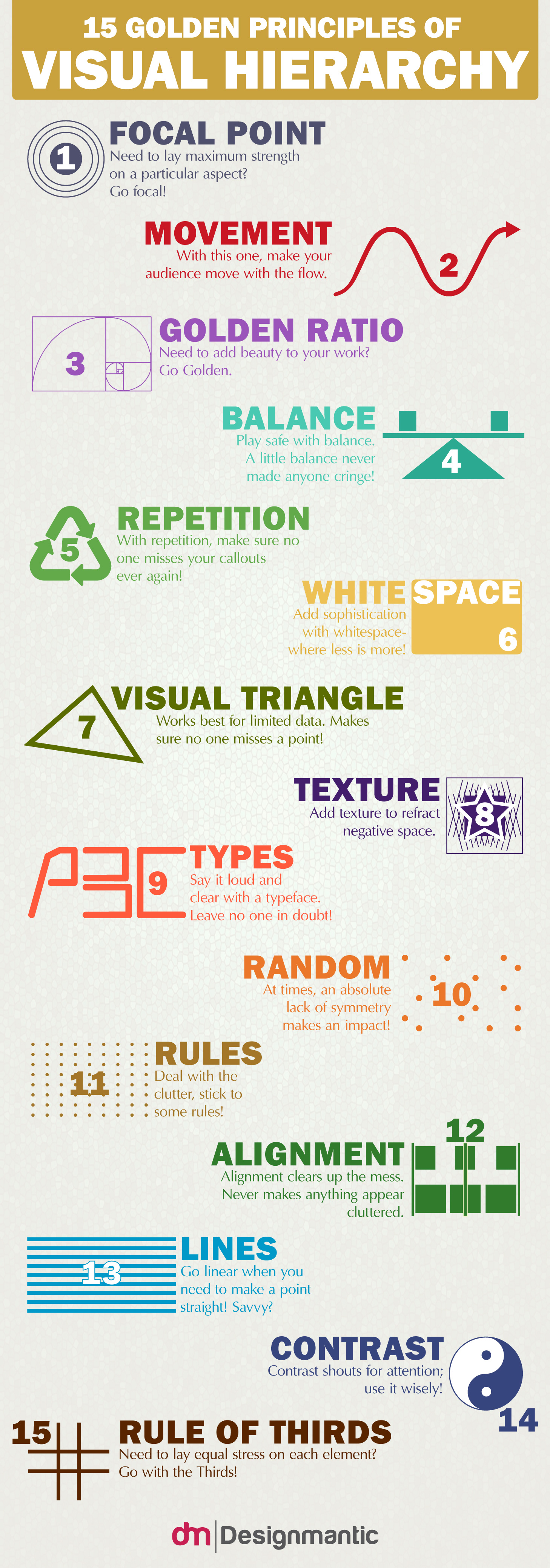
Principles of Design
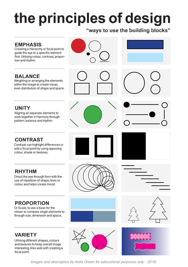
- Emphasis: Creating a hierarchy or focual point to guide the eye to a specific element first. Utilizating color, contract, proportion and rhythm.
- Balance: Weighting or arranging the elements within the image to create visual, even distribution of shape and space.
- Unity: Aligning all the separate elements to work together in harmony through pattern, balance and rhythm.
- Contrast: Contrast can highlight differences or add a focal point by using opposing color, shade or textures.
- Rhythm: Direct the eye through form with the use of repetition of shape, lines or color and helps create mood.
- Proportion: or scale, to use a base for the viewer to compare single elements to through size, dimension and space.
- Variety: Utilizing different shapes, colors, textures to keep overall image interesting. Also aids with creating a focal pont.
Principles of Visual Design
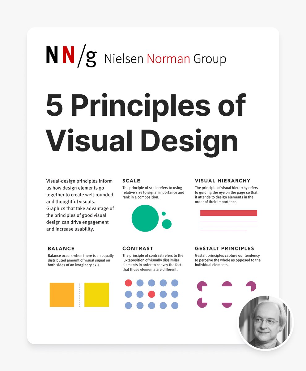
- Balance: Balance occurs when there is an equally distributed amount of visual signal on both sides of an imaginary axis.
- Scale: The principle of scale refers to using relative size to sign importance and rank in a composition.
- Contrast: The principle of contract refers to the juxtaposition of visually dissimilar elements in order to convey the fact that these elements are different.
- Visual Hierarchy: The principle of visual hierarchy refers to guiding the eye on the page so that it attends to design elements in the order of their importance.
- Gestalt Principles: Gestalt principles capture our tendency to perceive the whole as opposed to the individual elements.
Visual-design principles inform us how to design elements go together to create well-reounded and thoughtful visuals.
Graphics that take advantage of the principles of good visual design can drive engagement and increase usuability.
Typography in UI Design
- Font Selection: Choose appropriate fonts that align with the project’s tone and readability requirements.
- Hierarchy: Establish a typographic hierarchy to emphasize key content and aid in scannability.
- Line Spacing and Kerning: Adjust line spacing and kerning for optimal legibility and readability.
- Responsive Typography: Implement responsive typography that adapts to different screen sizes and resolutions.
- Accessibility: Ensure that typography is accessible, with sufficient contrast and consideration for users with visual impairments.
Typography in UI design is a critical element that influences readability, user engagement, and overall aesthetics, making it essential for effective communication.
Typography and Emotion
- Font Choice: The choice of fonts can evoke specific emotions. For example, sans-serif fonts like Arial often convey a modern and clean look, while script fonts can evoke a sense of elegance and personal touch.
- Font Weight: The weight of a font (e.g., bold, regular, light) can influence the perceived importance of text elements. Bolder fonts can convey confidence and strength, while lighter fonts may feel more delicate.
- Font Size: Larger fonts can emphasize important information and convey a sense of urgency or importance, while smaller fonts may suggest subtlety and nuance.
- Spacing and Kerning: Proper spacing and kerning between letters and lines can impact readability and user experience. Adequate spacing can make text more comfortable to read and enhance the overall design’s aesthetics.
- Color and Contrast: The color of text and its contrast with the background can affect readability and emotional impact. High contrast can create a sense of vibrancy and excitement, while low contrast may convey a calm and soothing mood.
Typography plays a crucial role in user interface design as it has the power to evoke emotions, influence user perception, and enhance the overall user experience. The choice of fonts, their weight and size, spacing, and color all contribute to how users interpret and feel about the content they encounter on a digital interface.
Color Theory and Palettes

- Color Psychology: Understand the psychological impact of colors and their association with emotions and perceptions.
- Color Harmony: Create harmonious color palettes that evoke the desired mood and aesthetics.
- Contrast and Legibility: Use color contrast effectively to enhance content legibility and visibility.
- Accessibility Guidelines: Adhere to accessibility guidelines for color choices to ensure inclusivity.
- Color Consistency: Maintain color consistency across the interface to reinforce brand identity and user recognition.
Color theory and palettes are integral to visual design, influencing user emotions, brand identity, and the overall user experience.
Visual Hierarchy
- Content Prioritization: Determine the importance of content elements and establish a visual hierarchy.
- Size and Scale: Use size and scale variations to emphasize primary content and guide user attention.
- Color and Contrast: Employ color and contrast to distinguish between elements and convey importance.
- Typography and Layout: Manipulate typography and layout to reinforce the hierarchy and content flow.
- User Flow: Design the interface to facilitate natural user flow, guiding users from one focal point to another.
Visual hierarchy is essential for guiding user attention, facilitating content comprehension, and enhancing the overall user experience by presenting information in a structured and meaningful manner.
Consistency in Design
- Element Consistency: Maintain consistent styling and placement of UI elements throughout the interface.
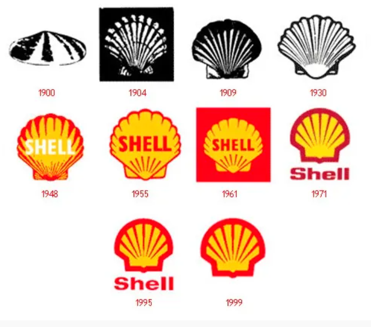
- Brand Consistency: Ensure brand elements, colors, and logos remain consistent for brand recognition.
- Navigation Consistency: Design consistent navigation patterns and menus for user familiarity.
- Content Consistency: Keep content formatting, typography, and tone consistent for a cohesive experience.
- Platform Consistency: Maintain consistency in design across different platforms and devices.
Consistency in design is a fundamental principle that enhances usability, user trust, and the overall user experience by reducing confusion and promoting familiarity.
Contrast and Readability
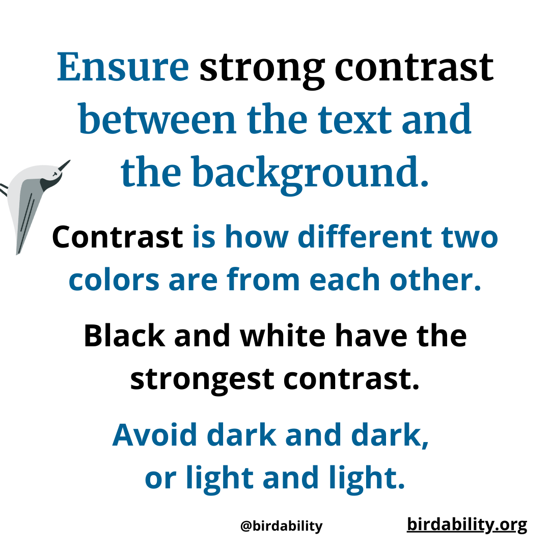
- Text Contrast: Ensure sufficient contrast between text and background for readability.
- Icon and Button Contrast: Use contrast to make icons and buttons stand out as interactive elements.
- Color Blindness Consideration: Design with consideration for users with color vision deficiencies.
- Text Size: Optimize text size for legibility, especially on small screens or at varying distances.
- User Testing: Validate contrast and readability choices through user testing to ensure user satisfaction.
Contrast and readability are crucial for ensuring that content is legible and accessible to all users, contributing to a positive user experience and effective communication.
Color Blindness Considerations
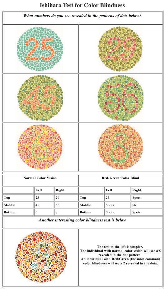
- Color Blindness Overview: Color blindness, or color vision deficiency, is a condition where individuals have difficulty perceiving certain colors, primarily red-green or blue-yellow. In UI design, it’s crucial to consider color blindness as a significant portion of the audience may struggle to distinguish key interface elements or content if color is the sole means of conveying information.
- Color and Information Conveyance: Color is often used in UI design to convey information, such as highlighting errors in red or indicating success in green. Designers must provide alternative methods like text labels, icons, or patterns alongside color cues to ensure that users with color blindness can understand and interact with the interface effectively.
- Contrast and Readability: Ensuring sufficient contrast between text and background colors is essential for readability, especially for users with color vision deficiencies. UI designers should follow accessibility guidelines to maintain a high contrast ratio, making text legible for all users, including those with color blindness.
- Color Palette Selection: Careful selection of color palettes is essential to accommodate users with color blindness. Designers should avoid relying solely on color-coding for differentiating elements and choose color combinations that are distinguishable even to individuals with common types of color vision deficiencies.
Understanding color blindness and its impact on UI design is essential for creating interfaces that are both aesthetically pleasing and functional for all users, regardless of their color vision capabilities.