From Glassmorphism to Minimalism
Bento boxes
 Bento Box design, a notable trend in UI design, stands out for its grid-based layout that organizes content into clear, manageable compartments. This structure not only enhances the visual hierarchy but also simplifies user navigation, allowing for effortless absorption of information. Each compartment, carefully designed for a specific function, presents information in a visually appealing and efficient manner.
This approach to design, inspired by the neat and functional arrangement of a traditional bento box, brings an organized aesthetic to digital interfaces. It’s particularly effective in creating responsive designs that are easily navigable and accessible. The structured layout ensures that information is presented in a clean and orderly fashion, significantly enriching the user experience.
Potential Drawbacks of Bento Box Design
- Limited Flexibility: The grid-based layout may struggle with complex or dynamic content, lacking the fluidity needed for more unconventional arrangements.
- Risk of Oversimplification: Its simplicity can lead to an under-representation of detailed or nuanced information. Visual Monotony: The repetitive use of rectangular shapes can result in a predictable and unengaging user interface if not creatively implemented.
- Space Constraints: The compartmentalized design might feel cramped when handling large amounts of data or content requiring more visual space.
- Design Homogeneity: The widespread adoption of this style risks a uniformity that could diminish a brand’s distinct identity in the digital landscape
Glassmorphism
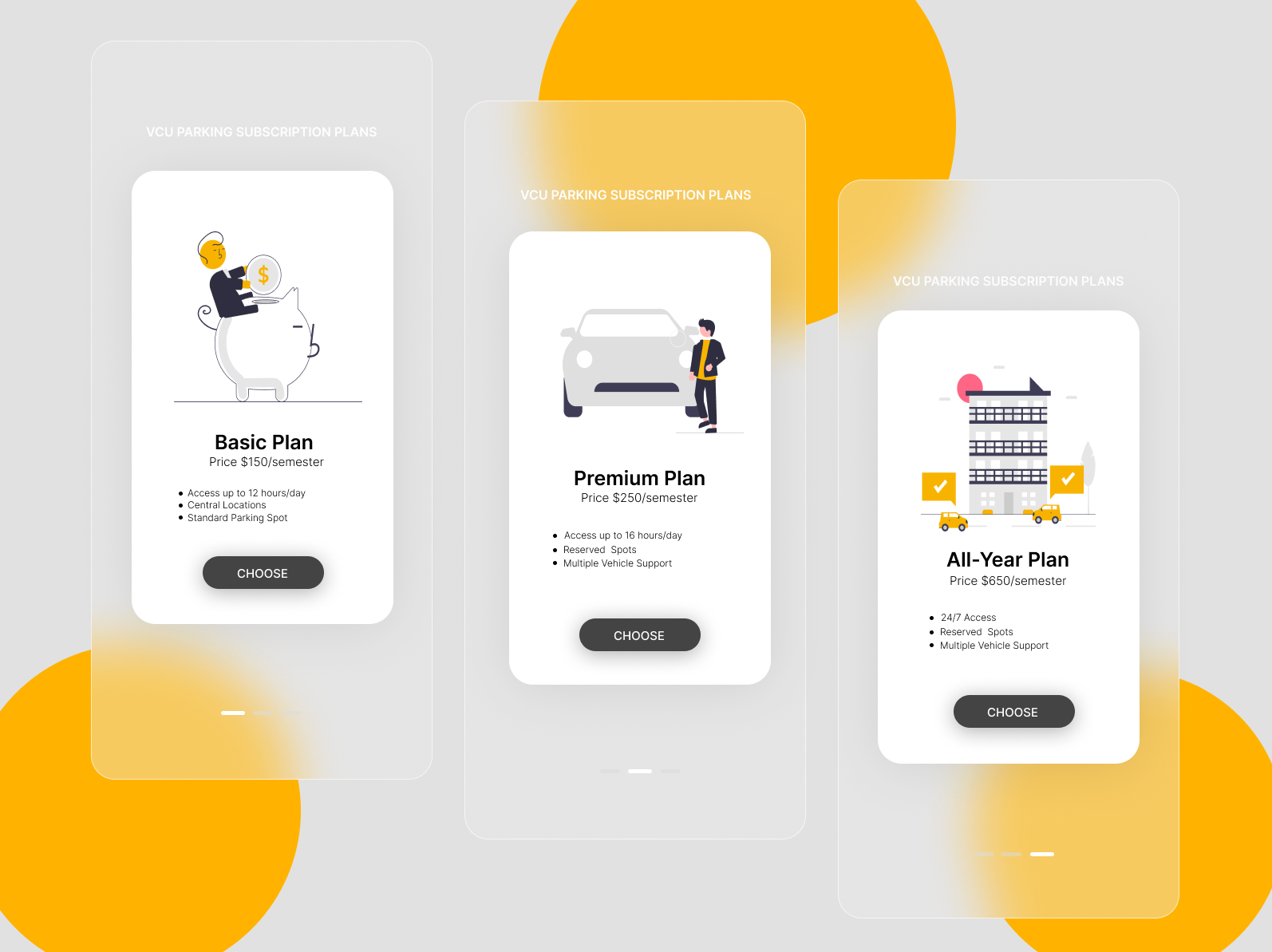
Incorporating glassmorphism into UI design can significantly enhance the visual appeal and user experience of software interfaces. Introduced into the mainstream design vocabulary around 2020, this style is characterized by its emulation of glass layers, marked by translucency and depth. This aesthetic, often likened to frosted glass, owes its emergence in part to the contributions of UI designer Michal Malewicz.
Employing a combination of transparency, frosted glass-like effects, and vibrant colors, glassmorphism creates an elegant and immersive interface. Its application is particularly prevalent in software services aiming for a modern, sleek appearance. This design approach is not only aesthetically pleasing but also effective in presenting complex information in a more accessible and engaging manner. The minimalist yet captivating nature of glassmorphism makes it a popular choice for designers seeking to balance simplicity with visual interest in their projects.

Potential Drawbacks of Glassmorphism:
- Limited Flexibility: The grid-based layout may struggle with complex or dynamic content, lacking the fluidity needed for more unconventional arrangements.
- Risk of Oversimplification: Its simplicity can lead to an under-representation of detailed or nuanced information.
- Visual Monotony: The repetitive use of rectangular shapes can result in a predictable and unengaging user interface if not creatively implemented.
- Space Constraints: The compartmentalized design might feel cramped when handling large amounts of data or content requiring more visual space.
- Design Homogeneity: The widespread adoption of this style risks a uniformity that could diminish a brand’s distinct identity in the digital landscape.
Dark Mode
Dark mode in UI/UX design, characterized by its dark background contrasted with light-colored text and elements, has risen in popularity across various digital platforms. This style choice, offering an alternative to traditional light modes featuring white or light backgrounds, is not just a matter of aesthetics but also caters to user comfort, especially in low-light environments.
This trend in UI design significantly reduces eye strain and fatigue, a crucial benefit in low-light settings where bright screens can be particularly harsh. On devices with OLED screens, dark mode can greatly extend battery life, as fewer pixels are illuminated. From a design perspective, it enhances visual hierarchy by making bright elements pop against the dark background, thereby focusing user attention. Content-wise, dark mode minimizes peripheral distractions, ensuring users concentrate on the essential elements. Additionally, its sleek and modern appeal aligns with current design trends, offering a level of personalization in the user interface.
Potential Drawbacks of Dark Mode Design:
- Accessibility Challenges: It can pose readability issues for users with visual impairments such as astigmatism or color blindness.
- Design and Branding Constraints: Not all design elements and color schemes adapt well to dark mode, potentially impacting branding consistency.
- Readability Challenges: For long-form or text-heavy content, dark mode can be strenuous, affecting readability.
- Limited Compatibility: Full support for dark mode across platforms and software can be inconsistent, requiring extra development effort.
- Aesthetic Inconsistency: Implementing dark mode without careful consideration of existing design elements can lead to an inconsistent user experience.
Vibrant Colors & Gradient
 The user of vibrant colors and gradients has become increasingly popular. Gradients, which involve a gradual transition from one color to another add depth, realism, and dynamism to the user interface. They are particularly effective when combined with vivid, eye-catching colors, creating a visually appealing and engaging experience for the user.
Vibrants colors, when used in gradients, can transform the aesthetic of an interface from mundane to captivating. This is because gradients inherently mimic the way light interacts with surfaces in the real world, where pure, solid colors are rare. By incorporating gradients that blend bright and bold colors, designers can achieve a more natural and relatable look, which resonates with users on a subsconscious level.
Moreover, gradients offer an artistic freedom that is limited only by the designer's imagination. The potential combinations of colors are virtually limitless, allowing for unique and memorable designs. This can be particularly beneficial in creating a hierarchy within the UI, as elements with gradient coloration can stand out amidst simpler designs, guiding the user's eye and emphasizing important features or actions.
However, they should be employed with a clear purpose and integrated thoughtfully into the overall design strategy. The decision to use a gradient should be driven by the goal of enhancing the user interface in a meaningful way, rather than merely following a trend. This thoughtful application ensures that the design remains user-centric, intuitive, and effective.
Potential Drawbacks of Using Vibrant Colors and Gradients:
Overwhelming Visuals: Vibrant colors and gradients, if overused or poorly combined, can create overly busy or overwhelming visuals, leading to user distraction or discomfort.
Readability Issues: High-intensity colors and complex gradients can sometimes make text hard to read, especially if there’s insufficient contrast between the text and the background.
Lack of Professionalism: Depending on the context, vibrant colors and gradients might not be suitable for more formal or corporate applications, potentially giving off an unprofessional or casual vibe.
Accessibility Concerns: Users with visual impairments or color blindness might find it challenging to navigate interfaces with high contrast gradients or overly vibrant colors.
Consistency Issues: Maintaining a consistent look and feel across different platforms and devices can be challenging with complex gradients and vibrant colors.
Brand Inconsistency: For brands with established visual identities, incorporating vibrant colors or gradients can clash with existing branding, leading to inconsistency.
Performance Impact: Complex gradients, especially those involving multiple colors or transparency, can be more demanding on rendering performance, impacting load times and responsiveness.
Minimalism
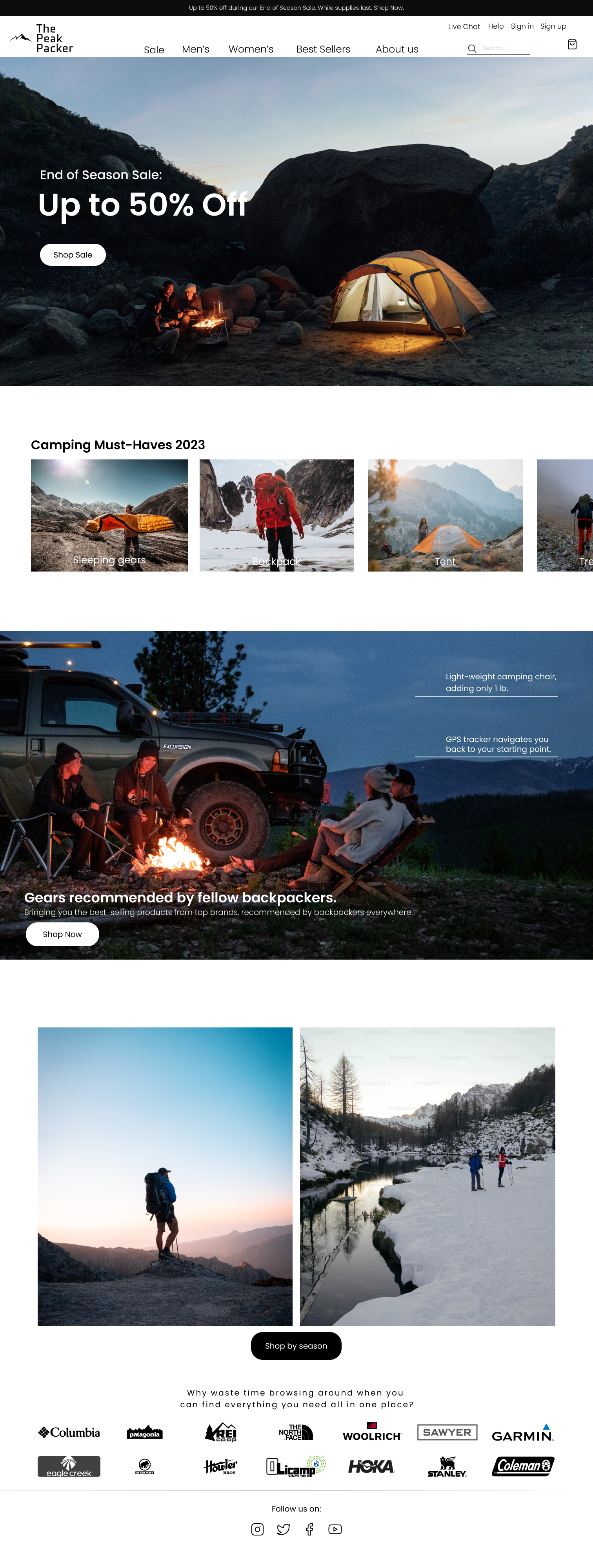
In the realm of UI/UX design, minimalism has become a prominent trend due to its ability to provide clean, uncluttered interfaces that focus on functionality and user experience. This design philosophy emphasizes simplicity, using only essential design elements to create user-friendly and visually appealing interfaces. By eliminating unnecessary components, minimalism centers on the user’s needs and goals, offering an intuitive interaction with digital products.
Potential Drawbacks of Minimalism:
- Risk of Oversimplification: Minimalism might oversimplify the interface, potentially omitting useful features or information that some users may find valuable.
- Limited Expressiveness: The restrained use of design elements can sometimes limit the ability to convey a brand’s personality or creativity fully.
- Potential Ambiguity: With fewer design elements, users may find it challenging to navigate or understand the interface if not executed with clarity.
- Lack of Emotional Connection: The stark nature of minimalism may fail to establish a strong emotional connection with users, especially in contexts where a more vibrant and engaging interface is needed.
