Strategies For Impactful UI
In the dynamic field of UI design, crafting impactful and effective interfaces requires a blend of creativity, technical skill, and strategic thinking. This guide will explore various methodologies, from leveraging visual hierarchy and color theory to understanding user psychology and accessibility standards. By employing these strategies, you can elevate your UI designs from merely functional to truly memorable, ensuring they resonate with users and stand out in the digital landscape.
Impact of Imagery
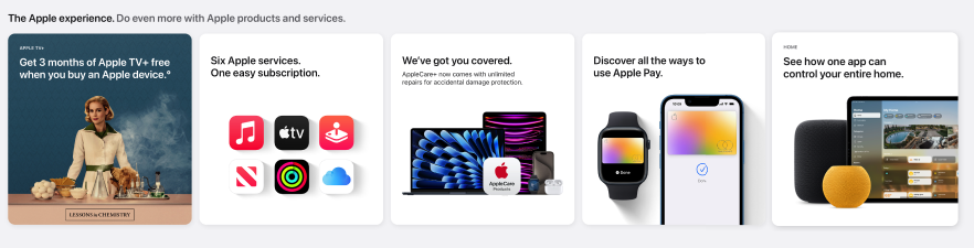
The use of images is crucial. High-quality, clear, and impactful images significantly enhance the overall impact of the interface. They should complement the design’s aesthetic and message, contributing to a professional and engaging user experience. Essentially, the right images are key to creating a visually appealing and cohesive UI.
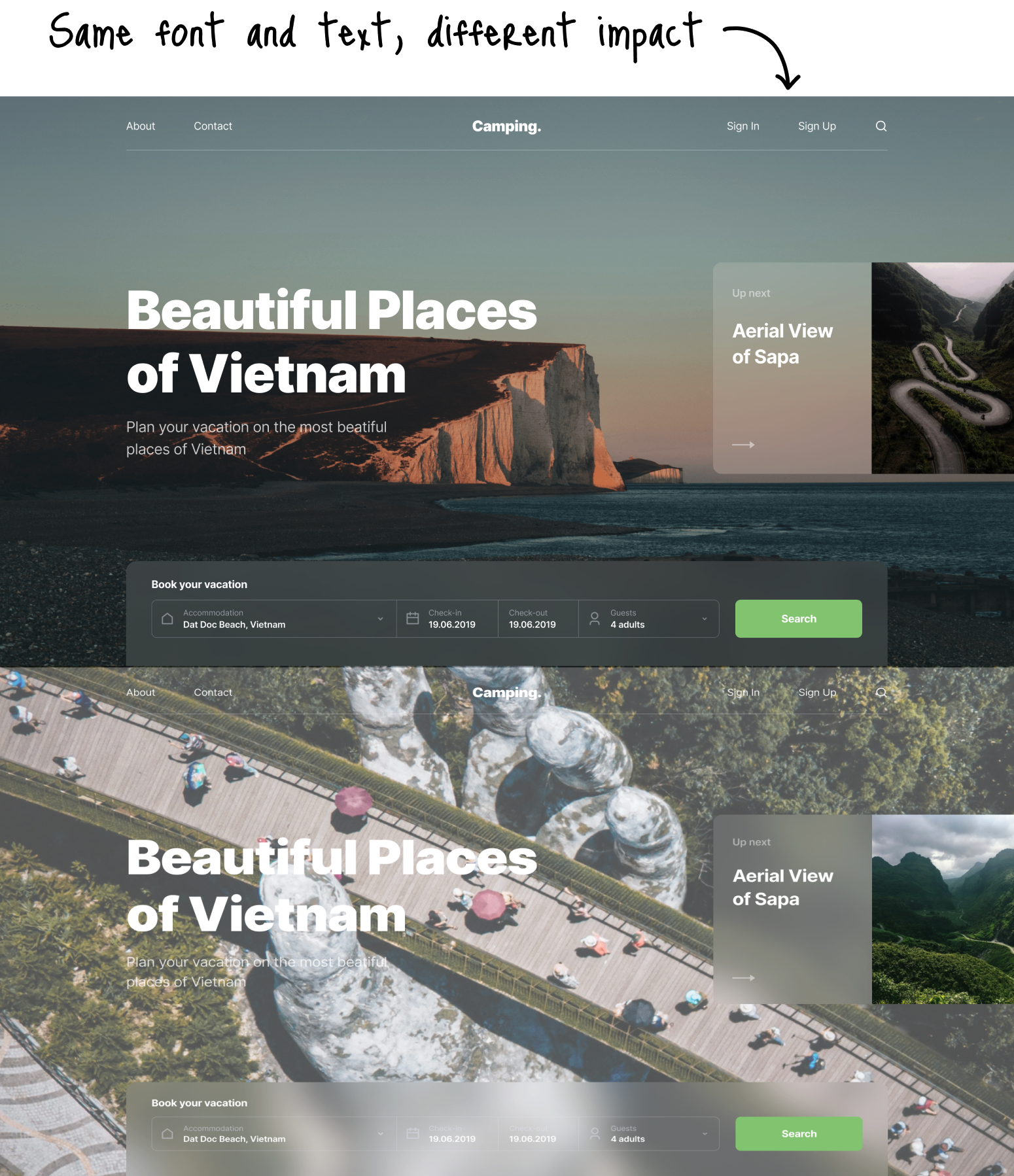
The term “hero image” in web design refers to a large, attention-grabbing picture with text typically shown in the above-the-fold area of the webpage, directly beneath the website header.
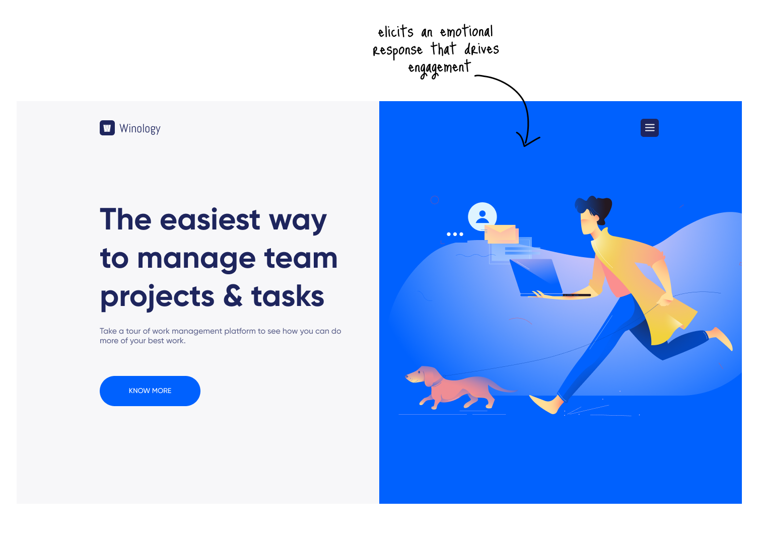
For a hero image to truly stand out and engage users, it should be carefully selected to elicit an emotional response that aligns with the intended mood and message of the site. The right hero image goes beyond mere decoration; it acts as a powerful tool to capture attention and drive user engagement by invoking emotions that resonate deeply with the audience.
Whether it’s inspiration, curiosity, joy, or trust, the image must match the exact emotional tone the site aims to evoke.
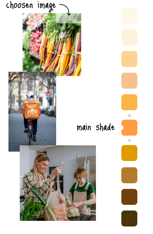
Staying on brand is a fundamental aspect of selecting images for UI design. It involves choosing visuals that not only complement but also enhance the product’s color scheme, contributing to a cohesive and harmonious visual experience. The images should align with the brand’s identity and aesthetic, reinforcing the overall theme and message. This consistency ensures that the imagery resonates with the brand’s values and style, creating a seamless integration between the visual elements and the brand’s narrative.
Psychology of Shapes
The psychology of shapes is the scientific study of how shapes influence people, playing a crucial role in creating user-friendly interfaces. By choosing shapes that elicit a specific reaction, designers can influence viewers’ feelings towards the design and what the shape represents. Different shapes convey unique meanings, and how a shape is styled or applied can greatly change its perceived meaning.
Types of shapes
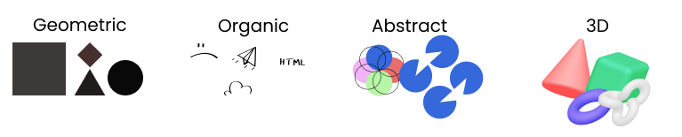
| - Easily recognizable - Often symmetric - Implies organization and efficiency |
- Pleasing and comforting - Irregular, asymetrical, curvy, uneven - Adds interest, reinforces themes |
- Recognizable, but not real form - Represent ideas and concepts - Stylized/simplified version of organic |
- Add depth and realism - Capture user's attention more effectively - Conveys a sense of innovation |
Shape is a powerful tools for guiding user perception and enhancing the visual appeal of an interface. Every shape, from simplicity of circles and squares to the complexity of abtracts forms, carries its own visual and psychological impact.
Do you remember the shape of your profile picture on social media? What shape is it? Have you noticed that most profile pictures are in a cicular shape?
Circles
Circles, with their smooth and continuous outline, are commonly used in UI design to convey a sense of completeness, fluidity, and movement. Symbolizing protection, friendliness, and comfort, they bring a graceful and inviting quality to the design. Here are reasons why circle is used in UI design:
- Symbolism: Circles represent unity, completeness, and harmony, conveying a sense of balance and wholeness in design.
- Attention-Grabbing: Their unique shape can draw attention and stand out in a layout dominated by angular elements.
- User-Friendly: Circles are often perceived as softer and more approachable, enhancing user comfort and engagement.
- Dynamic Movement: The round shape implies motion, making circles ideal for buttons or interactive elements that suggest action.
- Visual Flow: They can help create a fluid visual flow, guiding the user's eye smoothly across the interface.
- Containment: Circles are perfect for containing icons or images, especially profile pictures, in a visually pleasing manner.
Additionally, circles are less commonly used in general UI design compared to squares or rectangles, which allows them to draw attention and provide emphasis effectively. Their use in profile images not only humanizes the user experience but also adds a subtle, yet powerful, element of approachability and friendliness to the interface.
Squares and Rectangles
Squares and Rectangles are among the most fundamental shapes used in UI design, serving as the building blocks for creating structured and organized interfaces. Their widespread use is attributed to several key reasons:
Familiarity and Clarity: Squares and rectangles mimic the shape of many physical objects and digital elements (like screens and cards), making them familiar to users and easy to recognize. This familiarity helps users navigate interfaces more intuitively.
Efficiency in Layout Design: Their straight edges and right angles fit naturally into grid layouts, which are essential for creating clean, aligned, and orderly designs. This geometric harmony facilitates efficient use of space and helps in organizing content in a visually appealing manner.
Versatility: These shapes are incredibly versatile and can be adapted for various UI elements, such as buttons, input fields, cards, and containers. This adaptability allows for a coherent look across different parts of an interface.
Hierarchy and Organization: Squares and rectangles can easily be scaled and styled to denote different levels of hierarchy and importance within the interface, guiding the user’s attention to key areas.
Compatibility: Given their simplicity, squares and rectangles ensure high compatibility across different devices and screen sizes, maintaining consistency in design and user experience.
Content Framing: These shapes are excellent for framing content, making text, images, and other media more digestible. Their defined boundaries can help segment information, improving readability and scannability.
Triangles
Triangle serve multiple purposes and convey a range of meanings, often depending on their orientation and context:
- Direction and Navigation: Triangles are frequently used to indicate direction, such as in arrow icons pointing left, right, up, or down, guiding users through navigation.
- Movement and Progress: The pointed nature of triangles can suggest movement or progression, making them suitable for progress indicators or to denote advancement in a process.
- Alerts and Warnings: Because of their sharp edges and pointed shape, triangles, especially when oriented with the point upwards, are often used for caution signs, warnings, or to draw attention to important notices.
- Dynamic Energy: Triangles can introduce a sense of dynamism and energy into a design, thanks to their angular and pointed appearance.
- Hierarchy and Focus: The use of triangles can help establish visual hierarchy, with the point leading the viewer’s eye to specific areas, thereby focusing their attention.
Visual Hierarchy
Visual hierarchy in UI design refers to the arrangement or presentation of elements in a way that implies importance, guiding the viewer’s eye through the content in a logical, intended order. It’s a fundamental principle that helps users process information efficiently by using visual cues to prioritize content, making interfaces more intuitive and user-friendly.
Key techniques to establish visual hierarchy include:
- Size and Scale: Larger elements are perceived as more important than smaller ones.
- Color and Contrast: Bright or contrasting colors draw attention more effectively than muted tones.
- Typography: Variations in font size, weight, and style can indicate the level of importance of different text elements.
- Spacing and Grouping: The use of space can group related items together or give prominence to more important elements.
- Alignment: Strategic alignment can lead the eye in a specific direction, emphasizing certain elements over others.
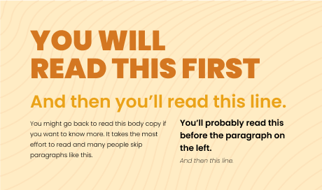
Think of visual hierarchy as a roadmap that guide users eyes through a website or app to the parts that are important to them and to product/business goals.
Break repetition to draw attention and emphasize.