Navigational Models
Overview
Navigational models, including popular approaches like hub-and-spoke, fully-connected, and more, are foundational frameworks in user interface design. These models establish the structure, organization, and pathways users follow when interacting with digital interfaces, greatly influencing their overall user experience. By selecting the appropriate navigational model, designers can create intuitive, efficient, and user-friendly systems that align with specific user needs and objectives.
Hub and Spoke
Simplified Navigation: This model streamlines navigation by consolidating options and reducing complexity, making it easier for users to find their desired content or actions.
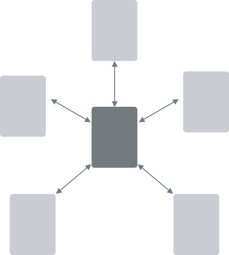
Clear Hierarchy: The central hub connects to “spoke” elements, which represent specific sections or functions. Users can navigate hierarchically from the hub to spokes, maintaining clarity in their journey.
Focused User Experience: The hub and spoke model focuses users on specific tasks or content areas, guiding them through a structured and organized experience.
Scalability: This navigational approach is highly adaptable and scalable, making it suitable for applications or websites with diverse content or functionalities.
Examples: iPhone home page
In a “hub and spoke” navigational model, a central hub acts as the core access point, simplifying navigation for users and offering a clear hierarchy of options. This approach provides a focused and scalable user experience by connecting users to specific content or functions through spokes, reducing cognitive load and improving usability. :::
Fully Connected

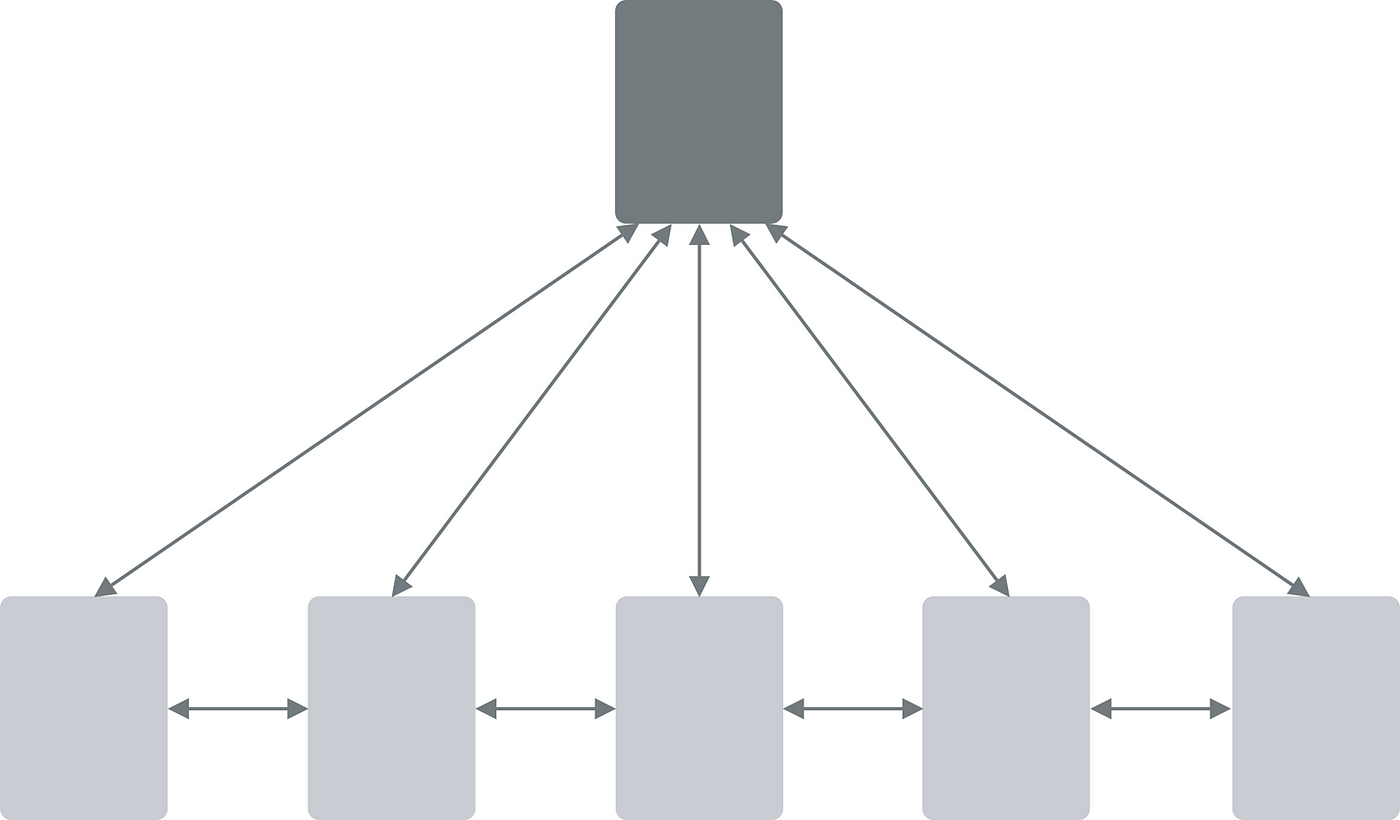
Direct Links: In a fully connected navigation model, every element or section within the interface is directly linked to one another, allowing users to access any part of the system from any point.
Minimal Hierarchy: This model minimizes hierarchy and promotes equal accessibility to all areas of the interface, granting users greater freedom to explore content and functionality.
Unrestricted Exploration: Users can freely jump between different sections, features, or pages without following a predefined path, providing a more exploratory experience.
Flexibility: The fully connected model is adaptable and suits interfaces with interconnected content or when users need constant access to various parts of the system.
User Autonomy: It empowers users to navigate based on their preferences, fostering a sense of control and personalization in their interactions.
Examples: Facebook. The user can easily transition from news feeds to profiles to comments and likes to groups to chat in any order.
In a “fully connected” navigational model, every element is directly linked, allowing users to navigate without strict hierarchies or predefined paths. This approach promotes user autonomy and flexible exploration, making it suitable for interfaces with interconnected content or those aiming to offer users greater freedom in their interactions.
Multilevel or Tree

Hierarchical Structure: This navigational model organizes content in a hierarchical tree-like structure, with a clear parent-child relationship between elements.
Levels of Depth: Users typically navigate through multiple levels or tiers, starting from a main menu or root node and progressing deeper into the content or functionality.
Breadth and Depth: The model allows for both breadth (access to various sections) and depth (in-depth exploration within each section) in the user’s journey.
Drill-Down Navigation: Users move through the hierarchy by selecting parent nodes to reveal child nodes, creating a structured and organized navigation experience.
Ideal for Complex Systems: The multilevel or tree model suits interfaces with complex information architecture, such as file systems, knowledge bases, or e-commerce websites with multiple categories and subcategories.
Examples: File system on a computer.
In a “multilevel or tree” navigational model, content is structured hierarchically, allowing users to navigate through multiple levels of depth, providing both breadth and depth in their interactions. This approach is particularly effective for interfaces with complex information organization, enabling users to explore and find specific content or functionality efficiently.
Step-by-Step

Sequential Progression: In this model, users are guided through a linear and sequential path, with each step leading to the next in a prescribed order.
Task-Oriented: It is commonly used for task-oriented interfaces, such as wizards, tutorials, onboarding processes, and forms with multiple sections.
Simplified Decision-Making: Users are presented with one decision or action at a time, reducing cognitive load and complexity during the interaction.
Clear Progress Indicators: The interface typically includes progress indicators or step counters, showing users where they are in the process and how many steps remain.
Error Reduction: By breaking tasks into manageable steps, this model helps reduce errors and ensures users complete each step before moving on.
Examples: A checkout process at an ecommerce web site, like Amazon.
In a “step-by-step” navigational model, users progress through tasks or processes one step at a time, following a predefined sequence. This approach is commonly used in scenarios where it’s essential to guide users through a structured and error-reduced journey, such as account creation, e-commerce checkouts, or software installation wizards.
Pyramid
Hierarchical Structure: The pyramid navigation model organizes content or options in a hierarchical manner, with a broad base representing the primary level and narrower levels above it.
Progressive Focus: As users move up the pyramid, the focus becomes narrower, guiding them from general categories or topics to specific subcategories or actions.
Simplified Decision-Making: Users start with a limited number of choices at the base, making it easier for them to make decisions and find their desired content or functionality.
Layered Exploration: Users can explore deeper into the hierarchy by selecting narrower categories or options, maintaining a sense of structure and organization.
Effective for Information Filtering: The pyramid model is effective for filtering and refining content, such as product categories, search results, or content libraries.
Examples: Produce category sections of an ecommerce web site.
In a “pyramid” navigational model, content is organized hierarchically, starting with a broad base and progressing toward narrower options as users move up. This approach simplifies decision-making, guides users through progressively focused choices, and is particularly useful for interfaces that require efficient content filtering and organization.
Pan and Zoom
Exploration through Movement: The pan-and-zoom navigation model enables users to explore content by panning (moving) and zooming (resizing) the viewport.
Commonly Used in Maps and Images: It is frequently employed in applications or interfaces where users interact with maps, images, or visual data, allowing for detailed examination.
Fluid and Dynamic: Users can dynamically adjust their view, zooming in for a closer look at specific areas and panning to explore different parts of the content.
Multi-Scale Experience: This model provides a multi-scale experience, accommodating both an overview of the entire content and a detailed view of specific regions.
Gestural Interaction: Pan-and-zoom navigation is often facilitated through gestures, such as pinch-to-zoom on touch screens or scroll and click-drag actions on desktop interfaces.
Examples: google maps
In a “pan-and-zoom” navigation model, users interact with content by moving and resizing their viewport, which is particularly effective for exploring visual data, maps, or images. This approach offers a dynamic and fluid experience, allowing users to navigate between different scales and levels of detail with ease.
Flat
Simplicity and Minimalism: The flat navigation model emphasizes simplicity and minimalism, often employing a single-level menu structure.
All Options Visible: In this model, all navigation options or links are typically visible on the screen at once, without the need for scrolling or hierarchical menus.
Easy Access: Users can easily access any section or feature of the interface directly from a single view, reducing the cognitive load associated with navigating through layers.
Common in Mobile Apps: Flat navigation is commonly used in mobile applications, where screen real estate is limited, and quick access to essential features is prioritized.
User-Centric Design: This model focuses on user-centered design principles by presenting all available options upfront, allowing users to make quick decisions and find what they need easily.
Examples: google sheets, excel, word, vscode.
In a “flat” navigation model, simplicity reigns as all navigation options are visible on a single screen or menu, facilitating easy access and straightforward user interactions. This approach is often favored in mobile apps and user-centric designs, promoting a clean and user-friendly interface.